

I am following the youtube video React Portfolio Website Tutorial From Scratch – Build & Deploy React JS Portfolio Website (2022) by EGATOR. Thanks to him!
I am using Windows10 and vscode to build this.
1. Prerequisites
- vscode installed
- Nodejs/NVM installed
- How to Build Portfolio Website with React-Part1
2. Components
Each sections will be built in a component.
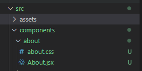
Create the components folder under src and about folder in it.
Create the files About.jsx and about.css.
In the About.jsx file type “rafce” to generate basic code for it and import css file. or you can copy/paste below code.
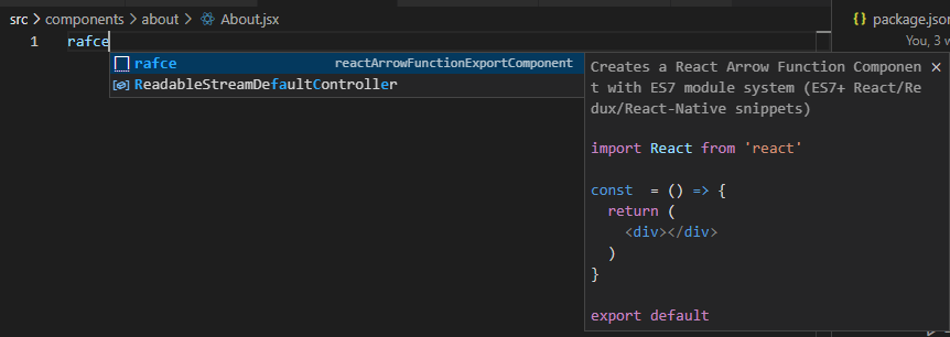
import React from 'react'
import './about.css'

const About = () => {
  return (
	<div>About</div>
  )
}

export default About
Repeat above to create more components you need.
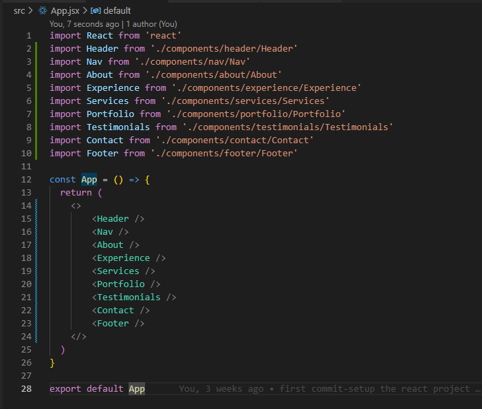
3. Import Components to App.jsx
Import Components and add under return.
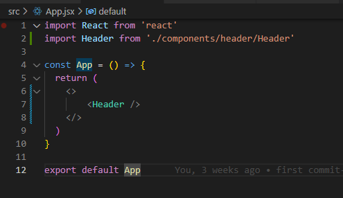
import React from 'react'
import Header from './components/header/Header'

const App = () => {
  return (
	<>
		<Header />
	</>
  )
}

export default App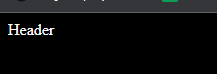
Then, you will be able to see “Header” on the screen instead “App”
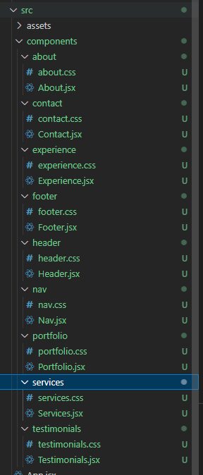
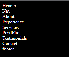
Now repeat above with other components as below.
4. General Style
Before we edit the component styles, we edit the general style which is the index.css.
At the end of this section, I will write the entire css code.
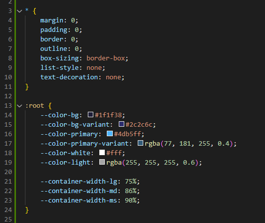
- * asterisk means every element should have these styles. it can be override in each component.
- under :root is css variables. it will make easier to customize entire website.
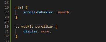
Make scroll smoothly and remove scroll bar.
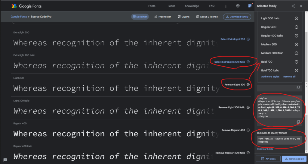
Now, we will get the basic fonts from google.
Go to google fonts site and choose what you want, copy style and import to the index.css.
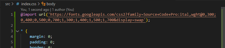
@import url('https://fonts.googleapis.com/css2?family=Source+Code+Pro:ital,wght@0,300;0,400;0,500;0,700;1,300;1,400;1,500;1,700&display=swap');
* {
margin: 0;
padding: 0;
border: 0;
outline: 0;
box-sizing: border-box;
list-style: none;
text-decoration: none;
}
:root {
--color-bg: #1f1f38;
--color-bg-variant: #2c2c6c;
--color-primary: #4db5ff;
--color-primary-variant: rgba(77, 181, 255, 0.4);
--color-white: #fff;
--color-light: rgba(255, 255, 255, 0.6);
--transition: all 400ms ease;
--container-width-lg: 75%;
--container-width-md: 86%;
--container-width-sm: 90%;
}
html {
scroll-behavior: smooth;
}
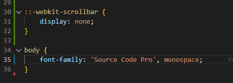
::-webkit-scrollbar {
display: none;
}
body {
font-family: 'Source Code Pro', monospace;
background: var(--color-bg);
color: var(--color-white);
line-height: 1.7;
background-image: url(../src/assets/bg-texture.png);
}
/* GENERAL STYLES */
.container {
width: var(--container-width-lg);
margin: 0 auto;
}
h1,
h2,
h3,
h4,
h5 {
font-weight: 500;
}
h1 {
font-size: 2.5rem;
}
section {
margin-top: 8rem;
}
section > h2,
section > h5 {
text-align: center;
color: var(--color-light);
}
section > h2 {
color: var(--color-primary);
margin-bottom: 3rem;
}
.text-light {
color: var(--color-light);
}
a {
color: var(--color-primary);
transition: var(--transition);
}
a:hover {
color: var(--color-white);
}
.btn {
width: max-content;
display: inline-block;
color: var(--color-primary);
padding: 0.75rem 1.2rem;
border-radius: 0.4rem;
cursor: pointer;
border: 1px solid var(--color-primary);
transition: var(--transition);
}
.btn:hover {
background: var(--color-white);
color: var(--color-bg);
border-color: transparent;
}
.btn-primary {
background: var(--color-primary);
color: var(--color-bg);
}
img {
display: block;
width: 100%;
object-fit: cover;
}
/* RESPONSIVE MEDIA QUERIES (MEDIUM DEVICES) */
@media screen and (max-width: 1024px) {
.container {
width: var(--container-width-md);
}
section {
margin-top: 6rem;
}
}
/* RESPONSIVE MEDIA QUERIES (SMALL DEVICES) */
@media screen and (max-width: 600px) {
.container {
width: var(--container-width-sm);
}
section >h2 {
margin-bottom: 2rem;
}
}I didn’t explain all the details of the css.
If you want the explanations, watch his video from 28 min.
Done for this post and will do edit each component on next post.
